
The very first entry I ever posted on Filed for Later (waaaaaay back in November '09) was based around this picture:


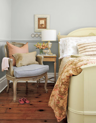
I'm not sure if Sarah is into painting the cupboards, particularly since she plans to replace them soon. But if she is, I think a soft ivory would be beautiful. Something along the lines of the bed in this picture. (Pasted again - no scrolling up needed.)

I love the peach stool at the foot of the bed!


I just love it. The muted color pallate is so soothing and calm and pretty. I had a great time combing my galleries of saved images for rooms that incorporate these colors. This was my favorite of the bunch:

My friend Sarah told me she was equally smitten with the colors. She asked for some images that she could use as inspiration for her master bathroom. She wrote:
"I'm redecorating (wish I could be remodeling) our master bathroom over the next couple of weeks. While a very light blue and white will be the main colors, I hope to be able to also use the palette in your soap post from a while back... Pretty sure that we're going to use brushed nickel for the new light fixtures and hardware. I am going for a coastal look without getting too into the theme since we're not exactly in a beach house."
Sarah's cabinets are a light/medium oak (she plans to replace the vanity eventually, and will likely choose either white or a very dark wood). The current counter is a "fabulous" white laminate.
She's already chosen the color - Benjamin Moore's glass slipper.

Isn't it pretty? It seems this color is most blogged about for its use in a bedroom that appeared in House Beautiful.

Here it is again, in Wes and Kayla's Brookline apartment on Apartment Therapy. (Side note: Yay, Boston!)

The interesting thing about Glass Slipper is, while there's actually very little (if any at all) blue in the soap photo ...
(see?) ... the color still works for the overall look. It is the right intensity, and maintains that washed pastel feel that makes up the "soap palette."
I'm not sure if Sarah is into painting the cupboards, particularly since she plans to replace them soon. But if she is, I think a soft ivory would be beautiful. Something along the lines of the bed in this picture. (Pasted again - no scrolling up needed.)
Another option is to go dark on the cupboards. This bedroom has dark, dark blue/gray walls that look very pretty against the blue bed.

Finally, a third option is to pick a medium shade of grayish blue (a few shades darker than Glass Slipper, and with more gray in it). The effect would be along the lines of this

or this

One thing that is particularly eye-catching with the soap photo is that there are so many colors used together. I say this calls for a stack of colorfully folded towels!

If there's room in the bathroom, wouldn't the towels look so pretty folded on this?

I have many more pictures to share with Sarah, but I'm going to save them for Part 2. Stay tuned for accessories and the question of brushed vs. polished nickel ...
1 comment:
I am inspired Julie! Thank you so much. You've given me something to think about...painted cabinets. I can't wait for Part 2. :-)
Post a Comment